Wirefront Settings Framework
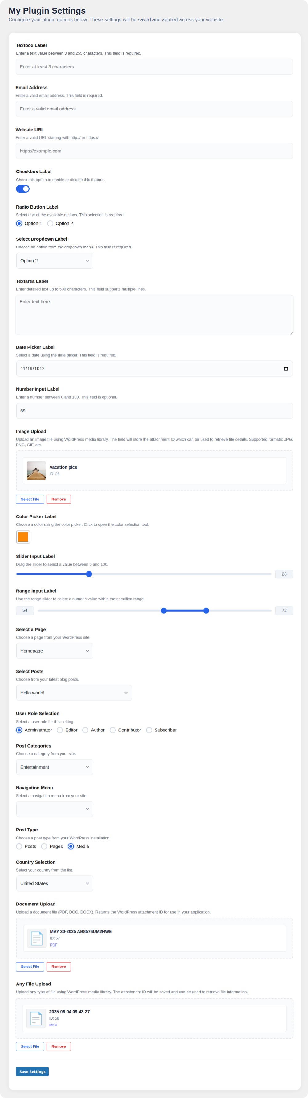
A lightweight developer-first WordPress settings framework that lets you define plugin options using a structured array. Includes all essential input types—textbox, checkbox, radio, select, file upload, sliders, and more.
by Jonathan Cabato · github.com/jonathancabato/wf-settings · website
Install
No release zip yet. The repository archive installs, but the folder name will carry the branch suffix and updates will not flow:
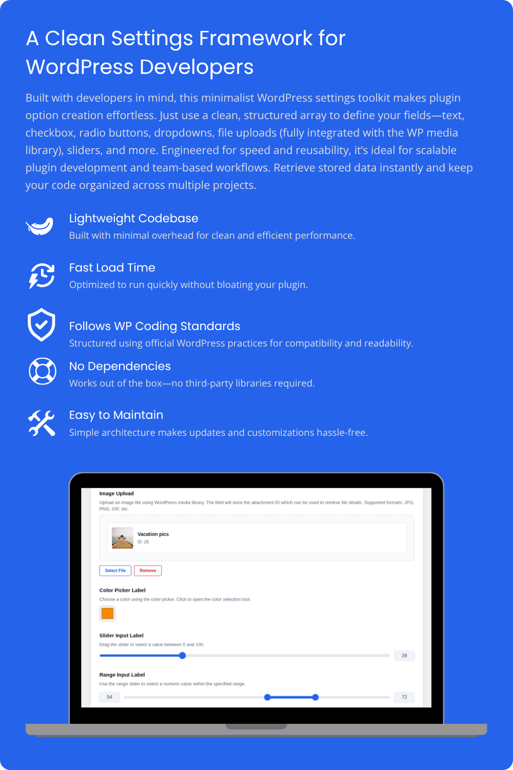
wp plugin install https://github.com/jonathancabato/wf-settings/archive/refs/heads/main.zipA lightweight developer-first WordPress settings framework that lets you define plugin options using a structured array. Includes all essential input types—textbox, checkbox, radio, select, file upload with WordPress media library integration, sliders, and more. Designed for fast prototyping and reuse across projects. Easily retrieve saved values. Perfect for teams building modular, consistent, and scalable plugins.
🚀 Complete Field Types & Features
The Wirefront Settings Framework provides a comprehensive collection of input field types, each designed to handle specific data requirements with built-in validation, styling, and WordPress integration. Below is the complete list of available field types with detailed descriptions and use cases.
📝 Text Input Fields
Textbox Field
The versatile textbox field supports various text input scenarios with comprehensive validation options. Perfect for collecting user names, titles, descriptions, or any string-based data.
Key Features:
- Custom placeholder text support
- Configurable character length limits (min/max)
- Built-in validation for different data types (string, email, URL)
- Required field validation
- XSS protection and data sanitization
Example Usage:
[
    "id" => "site-title",
    "label" => "Website Title",
    "type" => "textbox",
    "placeholder" => "Enter your website title",
    "required" => true,
    "validation" => [
        "type" => "string",
        "minLength" => 3,
        "maxLength" => 100
    ]
]
Email Validation Field
Specialized textbox with built-in email validation, ensuring users enter properly formatted email addresses. Includes client-side and server-side validation.
Key Features:
- Real-time email format validation
- Domain validation checks
- Auto-completion support
- Spam protection considerations
Example Usage:
[
    "id" => "admin-email",
    "label" => "Administrator Email",
    "type" => "textbox",
    "placeholder" => "admin@yoursite.com",
    "required" => true,
    "validation" => [
        "type" => "email"
    ],
    "description" => "Enter a valid email address for admin notifications"
]
URL Validation Field
Designed for collecting website URLs with automatic protocol validation. Ensures users enter valid web addresses starting with http:// or https://.
Key Features:
- Protocol validation (http/https)
- Domain format checking
- Auto-protocol addition
- Link preview capabilities
Example Usage:
[
    "id" => "company-website",
    "label" => "Company Website",
    "type" => "textbox",
    "placeholder" => "https://www.yourcompany.com",
    "required" => false,
    "validation" => [
        "type" => "url"
    ],
    "description" => "Enter your company's website URL"
]
📄 Text Area Field
Multi-line Text Area
Perfect for collecting longer text content such as descriptions, comments, or configuration data. Supports rich formatting and extensive content validation.
Key Features:
- Configurable rows and columns
- Auto-resize functionality
- Content sanitization
Example Usage:
[
    "id" => "site-description",
    "label" => "Site Description",
    "type" => "textarea",
    "placeholder" => "Describe your website...",
    "validation" => [
        "type" => "textarea",
        "minLength" => 10,
        "maxLength" => 500
    ]
]
✅ Selection Fields
Checkbox Field
Simple boolean input for enable/disable options, feature toggles, or agreement confirmations. Returns true/false values with elegant styling.
Key Features:
- True/false value handling
- Custom styling options
- Accessibility compliant
- Required field support for agreements
Example Usage:
[
    "id" => "enable-notifications",
    "label" => "Enable Email Notifications",
    "type" => "checkbox",
    "value" => true,
    "description" => "Receive email updates about important events"
]
Radio Button Groups
Single-selection input allowing users to choose one option from multiple predefined choices. Perfect for settings where only one value should be selected.
Key Features:
- Custom value/label pairs
- Validation for required selections
- Easy option management
Example Usage:
[
    "id" => "theme-style",
    "label" => "Theme Style",
    "type" => "radio",
    "options" => [
        ["value" => "light", "label" => "Light Theme"],
        ["value" => "dark", "label" => "Dark Theme"],
        ["value" => "auto", "label" => "Auto (System Preference)"]
    ],
    "required" => true
]
Select Dropdown
Compact single-selection input perfect for longer option lists. Provides a clean interface when screen space is limited while offering extensive option management.
Key Features:
- Compact design for numerous options
- Dynamic option loading
- Integration with WordPress data sources
Example Usage:
[
    "id" => "default-post-status",
    "label" => "Default Post Status",
    "type" => "select",
    "options" => [
        ["value" => "draft", "label" => "Draft"],
        ["value" => "pending", "label" => "Pending Review"],
        ["value" => "publish", "label" => "Published"]
    ]
]
📅 Date & Time Fields
Date Picker
Modern date selection interface using WordPress's built-in date picker. Provides consistent user experience across the WordPress admin area.
Key Features:
- WordPress native date picker integration
- Localization support
- Date format consistency
- Range restrictions (min/max dates)
- Calendar popup interface
- Keyboard navigation support
Example Usage:
[
    "id" => "event-date",
    "label" => "Event Date",
    "type" => "date",
    "required" => true,
    "description" => "Select the date for your event"
]
🔢 Numeric Input Fields
Number Input
Precise numeric input with built-in validation for integers and decimals. Perfect for quantities, prices, percentages, or any numeric configuration.
Key Features:
- Min/max value validation
- Number format validation
- Currency support (with formatting)
Example Usage:
[
    "id" => "max-posts",
    "label" => "Maximum Posts per Page",
    "type" => "number",
    "min" => 1,
    "max" => 100,
    "value" => 10,
    "validation" => [
        "type" => "number",
        "min" => 1,
        "max" => 100
    ]
]
Slider Input
Interactive slider for selecting numeric values within a defined range. Provides immediate visual feedback and intuitive user interaction.
Key Features:
- Visual range representation
- Real-time value updates
- Range markers and labels
- Touch/mobile friendly
- Accessibility keyboard support
Example Usage:
[
    "id" => "image-quality",
    "label" => "Image Compression Quality",
    "type" => "slider",
    "min" => 0,
    "max" => 100,
    "step" => 5,
    "value" => 85,
    "description" => "Higher values mean better quality but larger file sizes"
]
Range Input
Similar to slider but with additional range selection capabilities. Perfect for setting minimum and maximum values simultaneously.
Key Features:
- Visual range representation
- Real-time value updates
- Dual-handle range selection
- Min/max value setting
- Range validation
- Touch/mobile friendly
- Accessibility keyboard support
Example Usage:
[
    "id" => "price-range",
    "label" => "Price Range Filter",
    "type" => "range",
    "min" => 0,
    "max" => 1000,
    "step" => 10,
    "value" => 250,
    "description" => "Set the price range for product filtering"
]

// Performance range
[
    "id" => "performance-level",
    "label" => "Performance Level",
    "type" => "range",
    "min" => 1,
    "max" => 10,
    "step" => 1,
    "value" => 5,
    "description" => "Adjust performance vs. resource usage balance"
]
🎨 Visual Input Fields
Color Picker
Professional color selection tool integrated with WordPress's color picker component. Perfect for theme customization, brand colors, or any visual styling options.
Key Features:
- WordPress native color picker
- Hex, RGB, HSL color support
- Color palette presets
- Transparency/alpha channel support
- Recent colors memory
- Accessibility considerations
Example Usage:
[
    "id" => "primary-color",
    "label" => "Primary Theme Color",
    "type" => "color",
    "value" => "#3498db",
    "description" => "Choose your primary brand color for the theme"
]

// Accent color with default
[
    "id" => "accent-color",
    "label" => "Accent Color",
    "type" => "color",
    "value" => "#e74c3c",
    "description" => "Select an accent color for buttons and highlights"
]
📁 File Upload Fields
WordPress Media Library Integration
Powerful file upload system that leverages WordPress's built-in media library. Provides professional file management with thumbnail previews, file type restrictions, and complete WordPress integration.
Key Features:
- WordPress Media Library integration
- File type restrictions with
acceptparameter - Thumbnail previews for images
- One-click file removal
- Attachment ID storage for optimal integration
- Multiple file format support (images, documents, videos, audio)
- File size validation
- Automatic file organization
- SEO-friendly file handling
Example Usage:
// Image upload with restrictions
[
    "id" => "company-logo",
    "label" => "Company Logo",
    "type" => "file",
    "accept" => ["image/*"],
    "description" => "Upload your company logo (JPG, PNG, GIF)"
]

// Document upload
[
    "id" => "terms-document",
    "label" => "Terms & Conditions",
    "type" => "file",
    "accept" => ["application/pdf", "application/msword"],
    "description" => "Upload your terms document (PDF or Word)"
]

// Any file type
[
    "id" => "general-file",
    "label" => "Upload Any File",
    "type" => "file",
    "description" => "Upload any type of file using WordPress media library"
]
Retrieving Uploaded Files:
// Get attachment ID
$logo_id = wf_settings_val('company-logo');

// Get complete file details
$file_details = wf_settings_get_attachment($logo_id);
// Returns: id, title, url, filename, type, ext, metadata, alt_text, caption, description

// Display image with WordPress responsive features
echo wp_get_attachment_image($logo_id, 'medium', false, ['alt' => 'Company Logo']);
🔒 Hidden Fields
Hidden Input
Store data that shouldn't be visible to users but needs to be maintained across form submissions. Perfect for tracking IDs, API keys, or system-generated values.
Key Features:
- Invisible to end users
- Maintains data integrity
- Form submission inclusion
- Security considerations
- Value persistence
Example Usage:
[
    "id" => "api-version",
    "label" => "API Version",
    "type" => "hidden",
    "value" => "2.1",
    "description" => "Internal API version tracking"
]

// User session tracking
[
    "id" => "session-token",
    "label" => "Session Token",
    "type" => "hidden",
    "value" => wp_generate_uuid4(),
    "description" => "Unique session identifier for this configuration"
]

// System configuration
[
    "id" => "install-timestamp",
    "label" => "Installation Timestamp",
    "type" => "hidden",
    "value" => current_time('timestamp'),
    "description" => "Tracks when the plugin was first configured"
]
🔁 Repeater Fields (NEW)
Dynamic Repeater Field
The Repeater Field type allows users to dynamically add or remove multiple input fields of the same type (textbox, email, url, number, date, textarea) with plus/minus buttons. This is ideal for collecting lists of emails, team members, URLs, dates, prices, or any repeatable data.
Key Features:
- Supports 6 subfield types:
textbox,email,url,number,date,textarea - Dynamic add/remove with plus/minus buttons
- Auto-focus on new fields
- Prevents removal of last field (clears content instead)
- Responsive, mobile-friendly UI
- WordPress admin styling and dashicons
- Indexed array data structure for easy retrieval
- Type-specific validation and sanitization
Example Usage:
// Basic text repeater
[
    "id" => "team-members",
    "label" => "Team Members",
    "type" => "repeater",
    "subfield_type" => "textbox",
    "subfield" => [
        "placeholder" => "Enter team member name"
    ]
]

// Email repeater with validation
[
    "id" => "contact-emails",
    "label" => "Contact Email Addresses",
    "type" => "repeater",
    "subfield_type" => "email",
    "subfield" => [
        "placeholder" => "Enter email address"
    ]
]

// Date repeater
[
    "id" => "important-dates",
    "label" => "Important Dates",
    "type" => "repeater",
    "subfield_type" => "date"
]
Other Supported Subfield Types:
// URL repeater
[
    "id" => "website-urls",
    "label" => "Website URLs",
    "type" => "repeater",
    "subfield_type" => "url",
    "subfield" => ["placeholder" => "https://example.com"]
]

// Number repeater
[
    "id" => "product-prices",
    "label" => "Product Prices",
    "type" => "repeater",
    "subfield_type" => "number",
    "subfield" => ["min" => 0, "max" => 10000, "step" => 0.01]
]

// Textarea repeater
[
    "id" => "descriptions",
    "label" => "Product Descriptions",
    "type" => "repeater",
    "subfield_type" => "textarea",
    "subfield" => ["placeholder" => "Enter product description here..."]
]
Retrieving Repeater Values:
$emails = wf_settings_val('contact-emails'); // Returns array of emails
$team = wf_settings_val('team-members'); // Returns array of names
🔧 Advanced Field Configuration
Every field type supports additional configuration options:
required: Make fields mandatory with validationdescription: Provide helpful context and instructionsplaceholder: Guide users with example inputvalidation: Custom validation rules and error messagesdefault values: Set intelligent defaults for better UX
📊 Dynamic Data Sources
One of the most powerful features of the Wirefront Settings Framework is its comprehensive data source system. Instead of manually defining static options, you can populate select dropdowns and radio buttons with dynamic WordPress data.
Built-in WordPress Data Sources
Pages Data Source
Automatically populate fields with all published WordPress pages, perfect for page selection dropdowns or navigation configuration.
[
    "id" => "homepage-selection",
    "label" => "Select Homepage",
    "type" => "select",
    "options" => wf_get_pages_data_source(),
    "description" => "Choose which page to use as your homepage"
]
Posts Data Source
Fetch posts from any post type with customizable limits and ordering. Ideal for featured post selection or content management.
[
    "id" => "featured-posts",
    "label" => "Featured Posts",
    "type" => "select",
    "options" => wf_get_posts_data_source('post', 10), // Latest 10 posts
    "description" => "Select posts to feature on your homepage"
]
User Data Sources
Access WordPress users with role filtering capabilities, perfect for author assignment or user management features.
[
    "id" => "default-author",
    "label" => "Default Author",
    "type" => "select",
    "options" => wf_get_users_data_source(['author', 'editor']),
    "description" => "Choose the default author for new posts"
]
Categories and Tags
Dynamic category and tag selection for content organization and filtering options.
[
    "id" => "primary-category",
    "label" => "Primary Category",
    "type" => "select",
    "options" => wf_get_categories_data_source(),
    "description" => "Select your primary content category"
]
Navigation Menus
Integrate with WordPress menu system for theme and plugin navigation options.
[
    "id" => "header-menu",
    "label" => "Header Menu",
    "type" => "select",
    "options" => wf_get_menus_data_source(),
    "description" => "Choose menu to display in header"
]
Post Types
Access all registered post types for dynamic content type selection.
[
    "id" => "archive-post-type",
    "label" => "Archive Post Type",
    "type" => "radio",
    "options" => wf_get_post_types_data_source(),
    "description" => "Select post type for archive pages"
]
User Roles
Dynamic user role selection for permission and access control features.
[
    "id" => "minimum-role",
    "label" => "Minimum User Role",
    "type" => "select",
    "options" => wf_get_user_roles_data_source(),
    "description" => "Set minimum role required for access"
]
Additional Built-in Sources
- Sidebars/Widget Areas:
wf_get_sidebars_data_source() - Themes:
wf_get_themes_data_source() - Active Plugins:
wf_get_plugins_data_source() - Countries:
wf_get_countries_data_source() - Timezones:
wf_get_timezones_data_source()
Creating Custom Data Sources
The framework makes it incredibly easy to create your own data sources. Simply create a function that returns an array of options in the correct format:
Basic Custom Data Source
function my_custom_data_source() {
    return [
        ['value' => 'option1', 'label' => 'First Option'],
        ['value' => 'option2', 'label' => 'Second Option'],
        ['value' => 'option3', 'label' => 'Third Option']
    ];
}

// Use in field definition
[
    "id" => "my-setting",
    "label" => "My Custom Setting",
    "type" => "select",
    "options" => my_custom_data_source(),
    "description" => "Choose from custom options"
]
Dynamic API Data Source
function get_external_api_data() {
    // Fetch data from external API
    $response = wp_remote_get('https://api.example.com/options');
    $data = json_decode(wp_remote_retrieve_body($response), true);

    $options = [];
    foreach ($data as $item) {
        $options[] = [
            'value' => $item['id'],
            'label' => $item['name']
        ];
    }

    return $options;
}
Database Query Data Source
function get_custom_post_meta_options() {
    global $wpdb;

    $results = $wpdb->get_results("
        SELECT DISTINCT meta_value
        FROM {$wpdb->postmeta}
        WHERE meta_key = 'custom_field'
        ORDER BY meta_value ASC
    ");

    $options = [];
    foreach ($results as $result) {
        $options[] = [
            'value' => $result->meta_value,
            'label' => ucfirst($result->meta_value)
        ];
    }

    return $options;
}
Cached Data Source
For performance optimization, especially with external APIs or complex queries:
function get_cached_data_source() {
    return wf_get_custom_data_source(
        'my_expensive_data_function',
        'my_cache_key',
        3600 // Cache for 1 hour
    );
}

function my_expensive_data_function() {
    // Expensive operation here
    sleep(2); // Simulate slow operation

    return [
        ['value' => 'data1', 'label' => 'Expensive Data 1'],
        ['value' => 'data2', 'label' => 'Expensive Data 2']
    ];
}
Data Source Best Practices
- Performance: Use caching for expensive operations
- Error Handling: Always include fallback options
- Sanitization: Sanitize all external data
- Pagination: Limit large datasets to prevent memory issues
- Localization: Support translation for labels
- Security: Validate and escape all data sources
🎯 Why Choose Wirefront Settings Framework?
Developer Experience
- Array-based configuration: Define all settings in a simple, readable array format
- No complex setup: Drop in your field definitions and you're ready to go
- Consistent API: All field types follow the same configuration pattern
- Rich validation: Built-in validation rules with custom message support
- WordPress integration: Seamless integration with WordPress standards and practices
Flexibility & Power
- 15+ field types: From simple text inputs to complex file uploads
- Dynamic data sources: Populate fields with live WordPress data
- Custom data sources: Easily create your own data providers
- Validation system: Comprehensive client and server-side validation
- Responsive design: Mobile-friendly interface out of the box
Production Ready
- Security focused: XSS protection, CSRF tokens, and data sanitization
- Performance optimized: Minimal footprint with smart caching
- Accessibility compliant: WCAG guidelines and keyboard navigation
- Translation ready: Full i18n support for global applications
- WordPress standards: Follows WordPress coding standards and best practices
Perfect for Teams
- Consistent UI: All plugins using the framework have the same look and feel
- Rapid prototyping: Quickly test ideas without building custom interfaces
- Code reusability: Share field definitions across projects
- Maintainable: Clean, documented code that's easy to modify
- Scalable: Handles simple plugins to complex enterprise applications
🔮 Future Development & Roadmap
The Wirefront Settings Framework is under continuous active development with regular updates and new features. We're committed to expanding the framework's capabilities based on community feedback and emerging WordPress development needs.
Upcoming Advanced Input Fields:
- 🔥 Multi-Select Dropdowns: Select multiple options with search and tagging
- 📋 Repeater Fields: Dynamic field groups for complex data structures
- 🗂️ Tab Groups: Organize related fields into tabbed interfaces
- 📊 Data Tables: Editable tables for structured data entry
- 🎛️ Toggle Switches: Modern iOS-style toggle controls
- 📅 Date Range Picker: Select start and end dates with calendar interface
- 🔗 Relationship Fields: Link to other WordPress content with search
- 🎨 Image Gallery: Multiple image upload with drag-and-drop reordering
- 📝 Rich Text Editor: WYSIWYG editor integration for formatted content
- 🗺️ Map Picker: Interactive maps for location selection
- ⚡ Conditional Logic: Show/hide fields based on other field values
- 🔄 Import/Export: Backup and transfer settings configurations
- 🌐 HTML Field: Accept and validate basic HTML input with syntax highlighting
Enhanced Existing Field Types:
📊 Number Input Enhancements:
- Step Increment/Decrement: Custom step values for precise control
- Decimal Place Control: Configurable decimal precision
- Currency Support: Built-in currency formatting with locale support
- Scientific Notation: Support for scientific number notation
📝 Textarea Enhancements:
- Live Character Count: Real-time character counting display
- Character Limit Alerts: Visual warnings when approaching limits
- Save Prevention: Block form submission when limits exceeded
- Word Count: Additional word counting capabilities
📋 Select Dropdown Enhancements:
- Advanced Search/Filtering: Real-time option filtering and search
- Option Grouping: Organize options into logical groups
- Enhanced Default Selection: Improved default value handling
- Multi-level Cascading: Dependent dropdown relationships
🎚️ Slider Input Enhancements:
- Custom Step Intervals: Configurable step values for precise control
- Visual Markers: Display step markers and value labels
- Range Indicators: Visual representation of acceptable ranges
📏 Range Input Enhancements:
- Custom Step Intervals: Configurable step values for both handles
- Dual Value Display: Show both minimum and maximum values
- Range Validation: Advanced validation for range relationships
Planned Framework Enhancements:
- REST API Integration: Access settings via WordPress REST API
- Advanced Validation: Custom validation rules and real-time feedback
- Theme Integration: Better theme compatibility and styling options
- Performance Optimization: Enhanced caching and lazy loading
- Developer Tools: Debug mode and field testing utilities
Stay tuned for regular updates as we continue to make this the most comprehensive WordPress settings framework available!