Proto-Blocks
A next-generation WordPress plugin that enables developers to create Gutenberg blocks using PHP/HTML templates instead of React.
by Gustavo Gomez · github.com/gustavogomez092/proto-blocks · website
Install
No release zip yet. The repository archive installs, but the folder name will carry the branch suffix and updates will not flow:
wp plugin install https://github.com/gustavogomez092/proto-blocks/archive/refs/heads/main.zip Proto-Blocks
A next-generation WordPress plugin that enables developers to create Gutenberg blocks using PHP/HTML templates instead of React.
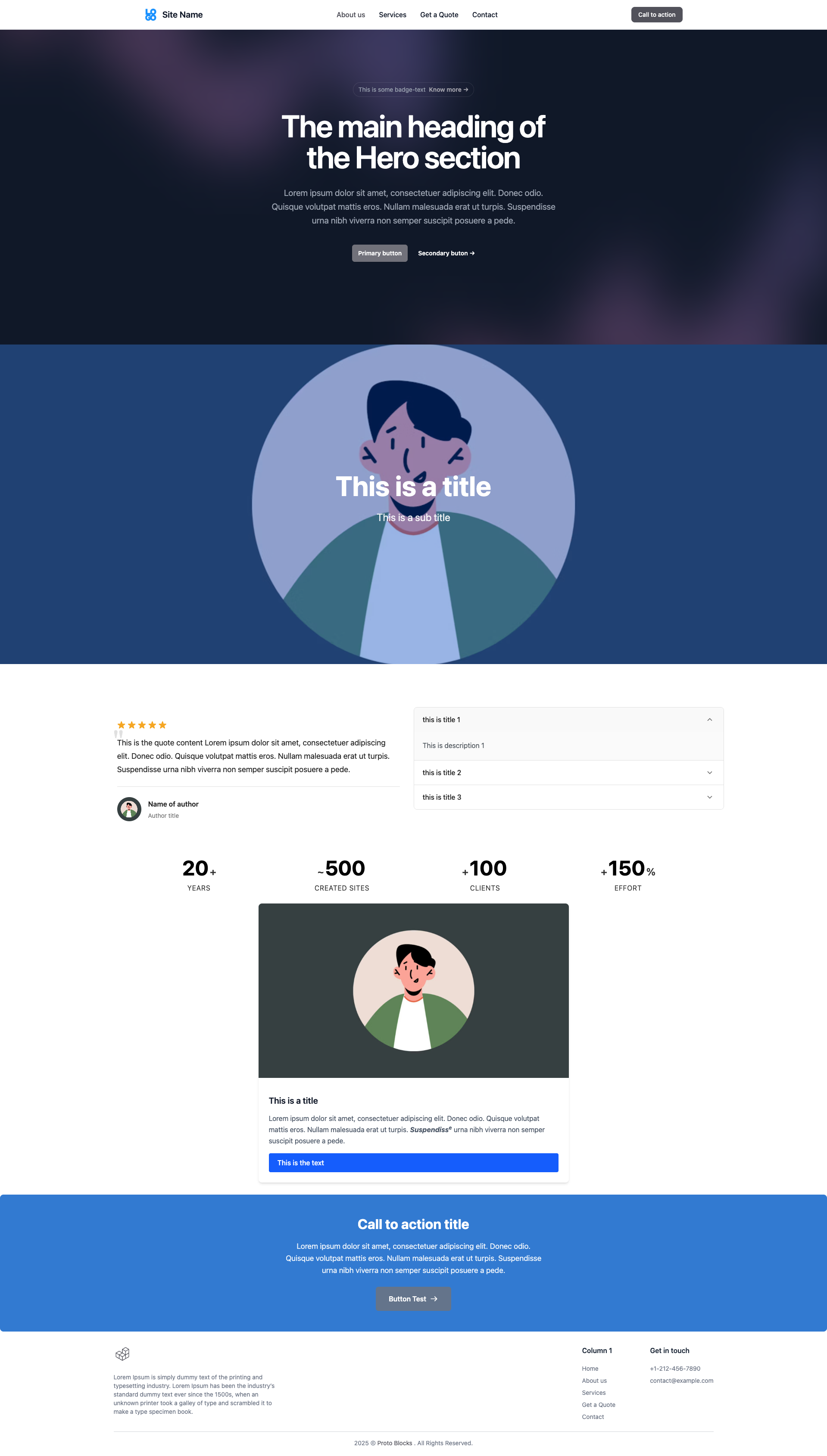 |
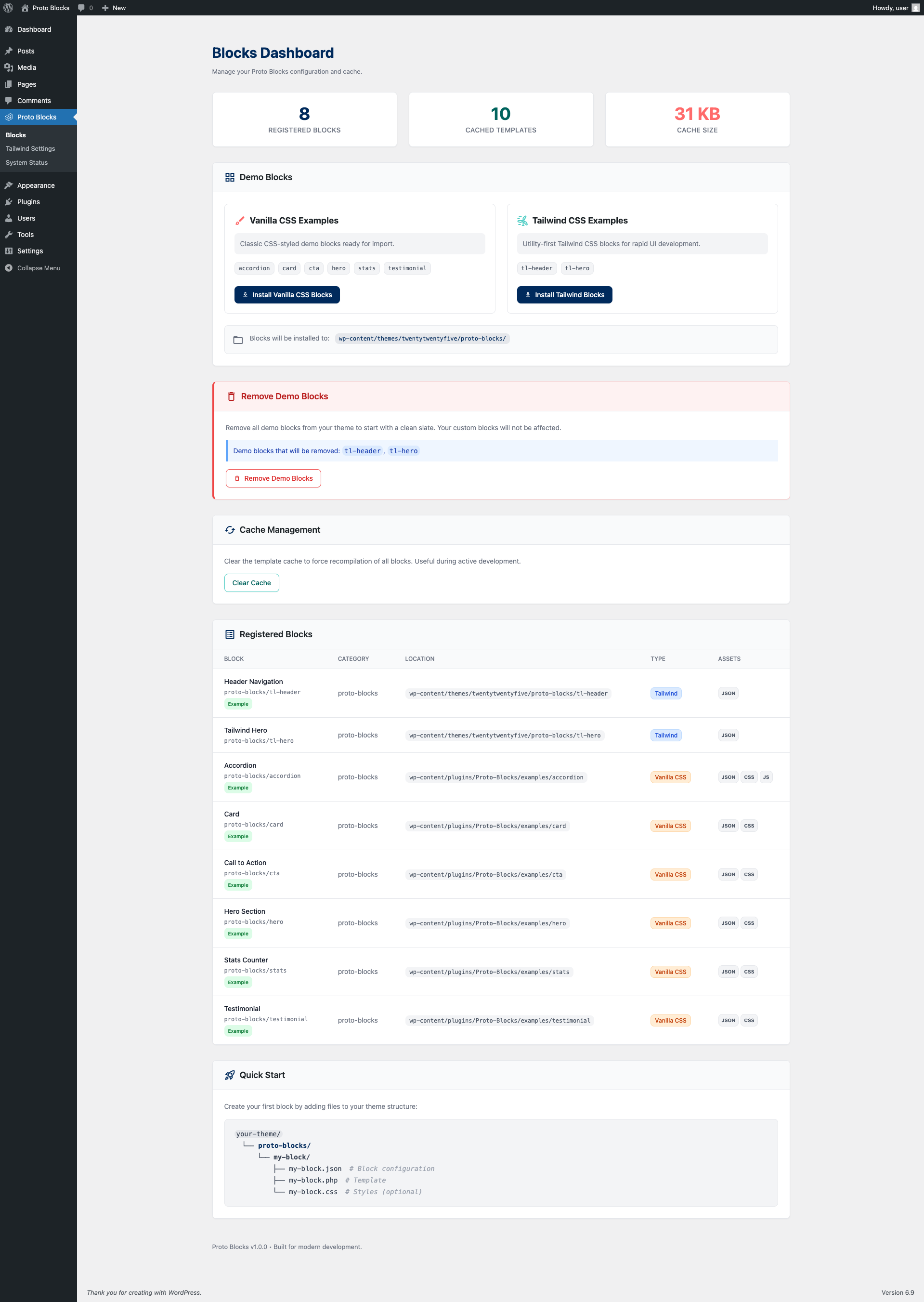 |
Features
- Single Source of Truth: Define blocks using a single
block.jsonfile - Template Caching: Compiled templates are cached for optimal performance
- Extensible Field Types: Plugin architecture for custom field types
- Enhanced Repeater: Drag-drop reordering, collapse/expand, duplicate, min/max limits, item-level link editing, and a flow-aware "add between" button that's never clipped by item styling
- Interactivity API Support: Full support for WordPress Interactivity API directives
- WP-CLI Commands: Scaffold, validate, and manage blocks from the command line
- TypeScript Editor: Type-safe editor components for better developer experience
- Tailwind v4 Support: Build blocks with Tailwind utilities; design tokens (
@theme) live in your theme repo - Scoped Preflight: Tailwind reset is wrapped in
:where(.proto-blocks-scope)so it only applies inside blocks -- no global resets bleeding into the rest of WP - Setup Wizard: Guided first-time configuration for quick setup
- Scroll-Reveal Animations:
data-proto-animatelifecycle with a safe-by-default reveal runtime (scroll-in reveal,prefers-reduced-motion, no-JS fallback, watchdog) — content is never left hidden. Seedocs/animation.md - Self-Updating: Pulls plugin updates from GitHub releases through the native WordPress update flow (stable releases only; no API key). Disabled automatically on git checkouts.
Requirements
- WordPress 6.3+
- PHP 8.0+
Installation
- Download or clone this repository to your
wp-content/pluginsdirectory - Run
npm installto install dependencies - Run
npm run buildto build the JavaScript assets - Activate the plugin in WordPress admin
Creating Your First Block
This guide walks you through creating a Proto Block from scratch. Proto Blocks use PHP templates instead of React, making them accessible to developers familiar with WordPress theme development.
Prerequisites
Before creating blocks, ensure you have:
- Proto-Blocks plugin activated
- A theme with write permissions
- Basic understanding of PHP and HTML
💡 Tip: Run the Setup Wizard first (Proto-Blocks menu) to install demo blocks. These serve as excellent references while building your own.
1. Create the Block Directory
Create a proto-blocks directory in your active theme:
your-theme/
└── proto-blocks/
    └── my-card/
        ├── block.json       ← Required: Block configuration
        ├── template.php     ← Required: PHP template
        ├── style.css        ← Optional: Block styles
        ├── view.js          ← Optional: Frontend JavaScript
        └── preview.png      ← Optional: Block preview image
⚠️ Warning: The block folder name must match the block name in
block.json(e.g., foldermy-card→ nameproto-blocks/my-card).
💡 Tip: Use lowercase letters and hyphens for folder names. Avoid spaces and special characters.
2. Define the Block Schema (block.json)
The block.json file is the heart of your block. It defines the block's identity, fields, and controls.
Minimal Example (Vanilla CSS)
{
    "$schema": "https://schemas.wp.org/trunk/block.json",
    "apiVersion": 3,
    "name": "proto-blocks/my-card",
    "title": "My Card",
    "category": "proto-blocks",
    "icon": "admin-post",
    "description": "A simple card block.",
    "keywords": ["card", "box", "content"],
    "protoBlocks": {
        "version": "1.0",
        "template": "template.php",
        "fields": {
            "title": {
                "type": "text",
                "tagName": "h3"
            },
            "content": {
                "type": "wysiwyg"
            }
        }
    }
}
Complete Example with All Options
{
    "$schema": "https://schemas.wp.org/trunk/block.json",
    "apiVersion": 3,
    "name": "proto-blocks/my-card",
    "title": "My Card",
    "description": "A versatile card with image, title, and content.",
    "category": "proto-blocks",
    "icon": "admin-post",
    "keywords": ["card", "box", "feature"],
    "supports": {
        "html": false,
        "anchor": true,
        "customClassName": true,
        "align": ["wide", "full"],
        "color": {
            "background": true,
            "text": true
        },
        "spacing": {
            "padding": true,
            "margin": true
        }
    },
    "protoBlocks": {
        "version": "1.0",
        "useTailwind": false,
        "template": "template.php",
        "fields": {
            "image": {
                "type": "image",
                "sizes": ["medium", "large"]
            },
            "title": {
                "type": "text",
                "tagName": "h3"
            },
            "content": {
                "type": "wysiwyg"
            },
            "link": {
                "type": "link",
                "tagName": "a"
            }
        },
        "controls": {
            "layout": {
                "type": "select",
                "label": "Layout",
                "default": "vertical",
                "options": [
                    { "key": "vertical", "label": "Vertical" },
                    { "key": "horizontal", "label": "Horizontal" }
                ]
            },
            "showLink": {
                "type": "toggle",
                "label": "Show Call to Action",
                "default": true
            }
        }
    }
}
Tailwind CSS Example
To create a Tailwind-styled block, set useTailwind: true:
{
    "$schema": "https://schemas.wp.org/trunk/block.json",
    "apiVersion": 3,
    "name": "proto-blocks/tw-card",
    "title": "Tailwind Card",
    "category": "proto-blocks",
    "icon": "admin-post",
    "protoBlocks": {
        "version": "1.0",
        "useTailwind": true,
        "template": "template.php",
        "fields": {
            "title": {
                "type": "text",
                "tagName": "h3"
            }
        }
    }
}
⚠️ Important: Tailwind blocks require Tailwind CSS to be enabled in Proto-Blocks > Tailwind Settings.
block.json Property Reference
| Property | Required | Description |
|---|---|---|
$schema |
No | WordPress block schema URL for IDE autocompletion |
apiVersion |
Yes | WordPress block API version (use 3) |
name |
Yes | Unique block identifier (namespace/block-name) |
title |
Yes | Human-readable block name shown in inserter |
category |
Yes | Block category (use proto-blocks or custom) |
icon |
No | Dashicon name (without dashicons- prefix) |
description |
No | Block description shown in inserter |
keywords |
No | Search keywords array |
supports |
No | WordPress block supports configuration |
protoBlocks |
Yes | Proto-Blocks specific configuration |
protoBlocks Property Reference
| Property | Required | Description |
|---|---|---|
version |
Yes | Proto-Blocks schema version (use "1.0") |
template |
Yes | PHP template filename |
useTailwind |
No | Enable Tailwind CSS support (true/false) |
fields |
No | Editable content fields (see Field Types) |
controls |
No | Inspector panel controls (see Control Types) |
isExample |
No | Mark as example block (for demo blocks) |
3. Create the Template (template.php)
The template renders your block's HTML. It receives three variables:
<?php
/**
 * Block Template: My Card
 *
 * @var array    $attributes Block attributes (field and control values)
 * @var string   $content    Inner blocks content (if using inner blocks)
 * @var WP_Block $block      Block instance (null in editor preview)
 */

// Always provide default values with null coalescing
$layout = $attributes['layout'] ?? 'vertical';
$show_link = $attributes['showLink'] ?? true;
$title = $attributes['title'] ?? '';
$content = $attributes['content'] ?? '';
$image = $attributes['image'] ?? [];
$link = $attributes['link'] ?? [];

// Detect editor preview mode
$is_preview = !isset($block) || $block === null;

// Build CSS classes
$classes = [
    'wp-block-proto-blocks-my-card',
    'my-card',
    'my-card--' . esc_attr($layout),
];

// Use WordPress function for wrapper attributes
$wrapper_attributes = get_block_wrapper_attributes([
    'class' => implode(' ', $classes),
]);
?>

<article <?php echo $wrapper_attributes; ?>>
    <?php if (!empty($image['url']) || $is_preview): ?>
        <figure class="my-card__image" data-proto-field="image">
            <?php if (!empty($image['url'])): ?>
                <img
                    src="<?php echo esc_url($image['url']); ?>"
                    alt="<?php echo esc_attr($image['alt'] ?? ''); ?>"
                    loading="lazy"
                />
            <?php endif; ?>
        </figure>
    <?php endif; ?>

    <div class="my-card__content">
        <h3 class="my-card__title" data-proto-field="title">
            <?php echo esc_html($title); ?>
        </h3>

        <div class="my-card__body" data-proto-field="content">
            <?php echo wp_kses_post($content); ?>
        </div>

        <?php if ($show_link): ?>
            <a
                href="<?php echo esc_url($link['url'] ?? '#'); ?>"
                class="my-card__link"
                data-proto-field="link"
                <?php echo !empty($link['target']) ? 'target="' . esc_attr($link['target']) . '"' : ''; ?>
            >
                <?php echo esc_html($link['text'] ?? 'Learn More'); ?>
            </a>
        <?php endif; ?>
    </div>
</article>
Template Best Practices
✅ Do: Always use
data-proto-fieldon elements that should be editable in the block editor.
✅ Do: Always provide default values using null coalescing (
??).
✅ Do: Always escape output (
esc_html(),esc_attr(),esc_url(),wp_kses_post()).
✅ Do: Use
get_block_wrapper_attributes()for the root element.
❌ Don't: Hide elements completely when empty - keep them for editor editing:
<!-- ❌ BAD: Can't edit when empty -->
<?php if (!empty($title)): ?>
    <h3><?php echo esc_html($title); ?></h3>
<?php endif; ?>

<!-- ✅ GOOD: Always shows editable element -->
<h3 data-proto-field="title"><?php echo esc_html($title); ?></h3>
❌ Don't: Forget to handle preview mode for repeaters:
<!-- ✅ GOOD: Provide default items for preview -->
<?php
if (empty($items)) {
    if ($is_preview) {
        $items = [
            ['title' => 'Item 1', 'content' => 'Click to edit...'],
            ['title' => 'Item 2', 'content' => 'Add more items...'],
        ];
    } else {
        return; // Don't render empty block on frontend
    }
}
?>
4. Add Styles (style.css) - Optional
Create a style.css file for your block styles:
/* Block: My Card */
.my-card {
    display: flex;
    flex-direction: column;
    background: #fff;
    border-radius: 8px;
    box-shadow: 0 2px 8px rgba(0, 0, 0, 0.1);
    overflow: hidden;
    transition: transform 0.2s, box-shadow 0.2s;
}

.my-card:hover {
    transform: translateY(-2px);
    box-shadow: 0 4px 16px rgba(0, 0, 0, 0.15);
}

.my-card--horizontal {
    flex-direction: row;
}

.my-card__image {
    margin: 0;
}

.my-card__image img {
    width: 100%;
    height: auto;
    display: block;
}

.my-card__content {
    padding: 1.5rem;
    display: flex;
    flex-direction: column;
    gap: 1rem;
}

.my-card__title {
    margin: 0;
    font-size: 1.25rem;
    font-weight: 600;
    color: #1a1a1a;
}

.my-card__body {
    color: #666;
    line-height: 1.6;
}

.my-card__link {
    display: inline-block;
    padding: 0.75rem 1.5rem;
    background: #0073aa;
    color: #fff;
    text-decoration: none;
    border-radius: 4px;
    font-weight: 500;
    margin-top: auto;
    align-self: flex-start;
}

.my-card__link:hover {
    background: #005a87;
}
💡 Tip: Proto-Blocks automatically enqueues
style.cssfiles from block directories.
5. Add Preview Image (preview.png) - Optional
Add a preview.png (400px wide recommended) to show in the block inserter instead of "No preview available".
Quick Start Checklist
- [ ] Created
proto-blocks/folder in theme - [ ] Created block subfolder with lowercase name
- [ ] Created
block.jsonwith required properties - [ ] Created
template.phpwithdata-proto-fieldattributes - [ ] Added default values for all attributes
- [ ] Escaped all output properly
- [ ] Tested block in editor and frontend
Common Mistakes to Avoid
| Mistake | Solution |
|---|---|
| Block not appearing | Check block.json syntax with JSON validator |
| Fields not editable | Ensure data-proto-field="fieldName" matches field key |
| Repeater not working | Use both data-proto-repeater and data-proto-repeater-item |
| Styles not loading | Check file is named style.css in block folder |
| Tailwind not working | Enable Tailwind in Proto-Blocks > Tailwind Settings |
| Preview shows error | Check PHP syntax, enable WP_DEBUG |
Field Types
Text Field
{
    "title": {
        "type": "text",
        "tagName": "h2"
    }
}
Inline formats
format decides which inline formatting the field's toolbar offers. It
defaults to standard.
format |
Toolbar offers |
|---|---|
plain |
Nothing — formatting is disabled entirely |
simple |
Bold, italic |
standard |
Bold, italic, link |
full |
Everything a wysiwyg field offers, including text colour, underline, inline image, strikethrough, sub/superscript, inline code and keyboard |
{
    "heading": {
        "type": "text",
        "tagName": "h2",
        "format": "full"
    }
}
Reach for full when a phrase inside an otherwise plain heading needs its own
treatment — colouring two words of a headline in a brand colour, say. The
colour tool lives under the ⌄ (More) button in the block toolbar, as
Highlight, and its swatches come from the theme's theme.json palette.
Colouring text writes a
<mark>tag, and browsers give<mark>a yellow background by default. Core suppresses that with an inlinebackground-color: rgba(0,0,0,0), butwp_kses_post()— which templates should run text fields through — stripsbackground-colorfrom inline styles, so the yellow comes back on the front end. A theme rule fixes it once:mark.has-inline-color { background-color: transparent; }
Image Field
{
    "image": {
        "type": "image",
        "sizes": ["medium", "large"]
    }
}
Video Field
Opens the media library filtered to video attachments and stores
{ id, url, mime }. Use it for self-hosted video (e.g. an MP4 source).
Optionally narrow (or widen) the picker with allowedTypes.
{
    "videoFile": {
        "type": "video",
        "allowedTypes": ["video"]
    }
}
Value shape: [ 'id' => int|null, 'url' => string, 'mime' => string ].
Bind data-proto-field to a <video> or <source> element to write the
src (and type on a <source>), or read $attributes['videoFile']['url']
directly in the template.
Link Field
{
    "link": {
        "type": "link",
        "tagName": "a"
    }
}
WYSIWYG Field
{
    "content": {
        "type": "wysiwyg"
    }
}
Repeater Field
{
    "items": {
        "type": "repeater",
        "min": 1,
        "max": 10,
        "itemLabel": "title",
        "collapsible": true,
        "fields": {
            "title": { "type": "text" },
            "content": { "type": "wysiwyg" }
        }
    }
}
Inner Blocks Field
Lets a block host nested WordPress blocks. The field type must be
"inner-blocks" with a hyphen — Proto-Blocks does not recognise
"innerblocks" (no hyphen) and will silently skip the slot, so the
editor renders the block as a leaf with no + appender and no
drop target. Only one inner-blocks field per block is supported.
{
    "innerContent": {
        "type": "inner-blocks",
        "allowedBlocks": ["core/paragraph", "core/heading"],
        "template": [["core/paragraph", {}]],
        "templateLock": false,
        "orientation": "vertical",
        "renderAppender": "default"
    }
}| Option | Type | Description |
|---|---|---|
allowedBlocks |
string[] |
Whitelist of block names. Omit to allow every block. |
template |
array |
Default blocks inserted when the parent block is first added. Format: [blockName, attrs?]. |
templateLock |
"all" \| "insert" \| "contentOnly" \| false |
Lock mode. Default false. |
orientation |
"vertical" \| "horizontal" |
Layout direction. Default "vertical". |
renderAppender |
"default" \| "button" \| false |
Which appender UI to show. Default "default" (the standard plus button). |
Pair the field with the data-proto-inner-blocks attribute in the
template — see the Inner Blocks template markup section
for the matching template snippet.
Container / wrapper blocks (a block whose primary purpose is to
host other blocks, à la core/group) should also enable
supports.layout so the editor renders the native Layout controls
(content width, wide width, justification) alongside the inner-blocks
slot:
"supports": {
    "layout": {
        "default": { "type": "constrained" },
        "allowSwitching": false,
        "allowEditing": true,
        "allowInheriting": true
    }
}
Pattern: composable content slots
Inner-blocks is more than a "container" field — it's the escape hatch that turns a block from a fixed shape into a composable surface. When a content area can't be enumerated up-front (free-form copy with mixed paragraphs / lists / headings, ad-hoc CTAs, embedded media, authoring decisions you don't know yet), expose one inner-blocks slot instead of a stack of typed fields. The block keeps its layout chrome; the slot hosts whatever the author drags in.
Why this scales
- One block, many shapes. Instead of inventing
bullets,bulletsLabel,bodyParagraph,bodyHeading… expose one slot and let authors compose. Adding a feature next quarter doesn't require editing the block. - Free reuse of every core feature. Text color, alignment, lists, columns, cover blocks, embeds — all of Gutenberg's editing chrome works inside the slot without you wiring anything.
- Brand semantics layer cleanly. Style the slot's typography once
and every author-composed body inherits it. For example, you can
paint
<strong>red site-wide inside that slot so authors get an inline "callout" look just by bolding.
Restoring typography inside the slot
Tailwind v4's preflight (and many design-system resets) strip list markers, paragraph margins, heading weights. Restore them inside the slot only with low-specificity rules so block-level overrides still win:
.my-block__body :where(p)            { margin: 0 0 0.75em; }
.my-block__body :where(p:last-child) { margin-bottom: 0; }
.my-block__body :where(ul)           { list-style: disc;    padding-left: 1.5rem; margin: 0 0 0.75em; }
.my-block__body :where(ol)           { list-style: decimal; padding-left: 1.5rem; margin: 0 0 0.75em; }
.my-block__body :where(h2, h3, h4)   { font-family: "Space Grotesk", sans-serif; font-weight: 700; }
.my-block__body :where(a)            { color: #d1001d; text-decoration: underline; }
.my-block__body :where(strong, b)    { font-weight: 700; color: #d1001d; }
The :where() wrapper keeps specificity at 0,0,0 so anything the
author sets in a child block's own settings panel beats these defaults.
When NOT to use it
If the slot has a strict shape (exactly 3 cards, exactly a title +
image + button), keep typed fields — they validate the layout and stop
authors from breaking it. Reach for inner-blocks when the slot's
purpose is variability.
Control Types
text- Text inputtextarea- Multi-line text inputselect- Dropdown selection (staticoptions, or server-loaded viaoptionsSource— see Dynamic / Server-Provided Options)multiselect- Ordered multi-selection storing an array of keys (sameoptions/optionsSourcecontract asselect— see The multiselect Control)toggle- Boolean togglecheckbox- Boolean checkboxrange- Slider with min/maxnumber- Numeric inputcolor- Color pickercolor-palette- Color palette selectionimage- Image selection from media librarygallery- Ordered list of images from the media library (stores[{ id, url, alt }]— see The gallery Control)video- Video selection from media library (stores{ id, url, mime }; optionalallowedTypes, defaults to["video"])radio- Radio button group
Media in the inspector:
imageandvideoare available both as field types (rendered inline viadata-proto-field) and as control types (rendered in the inspector panel). Use the control form when the picker should live in the sidebar rather than inline in the block preview.
{
    "controls": {
        "videoFile": {
            "type": "video",
            "label": "Video file",
            "allowedTypes": ["video"]
        }
    }
}
The value is read in the template as $attributes['videoFile']['url'].
Conditional Controls
Controls can be conditionally shown based on other control values:
{
    "imagePosition": {
        "type": "select",
        "label": "Image Position",
        "options": [...],
        "conditions": {
            "visible": {
                "layout": ["horizontal"]
            }
        }
    }
}
Dynamic / Server-Provided Options
A select control normally lists a fixed options array. When the choices come
from your site's data — existing pages, categories, users — or from a value that
only the server knows, declare an optionsSource instead. The control fetches
its options live in the editor (via REST) and renders an async dropdown (a spinner
while loading), so newly created content appears without rebuilding the block.
{
    "controls": {
        "relatedPage": {
            "type": "select",
            "label": "Related Page",
            "optionsSource": "wp:posts",
            "sourceArgs": { "post_type": "page", "per_page": 50 }
        },
        "category": {
            "type": "select",
            "label": "Category",
            "optionsSource": "wp:terms",
            "sourceArgs": { "taxonomy": "category" }
        }
    }
}
A control is "dynamic" the moment it has an optionsSource; options is then
optional and ignored. sourceArgs is an optional object passed to the provider
(only keys the provider allow-lists are forwarded).
The stored value is the option key (e.g. a post ID as a string). Read it in your template like any other control and resolve it as needed:
$relatedPage = $attributes['relatedPage'] ?? '';
$pageTitle   = $relatedPage ? get_the_title( (int) $relatedPage ) : '';
Built-in sources:
optionsSource |
Returns | sourceArgs |
|---|---|---|
wp:posts |
Published posts of a type | post_type (default post), per_page (default 50), search |
wp:terms |
Terms of a taxonomy | taxonomy (default category), per_page (default 100), search |
wp:users |
Site users | per_page (default 50), search |
per_page is clamped server-side to 1–200. Option keys are post IDs, term IDs,
and user IDs respectively. To expose your own data (an external API, plugin
settings, a static table), register a custom provider — see
Register a Custom Options Provider.
Permissions / REST: the editor loads options from
GET /wp-json/proto-blocks/v1/controls/options?source=<id>&args=<json>, gated by theedit_postscapability. A working example block ships inexamples/dynamic-select/, and the full developer reference lives indocs/dynamic-control-options.md.
Template Markup
Proto-Blocks uses special data-proto-* attributes to make template elements editable in the WordPress block editor.
Basic Field Binding
Use data-proto-field to bind an element to a field:
<!-- Text field - editable inline -->
<h2 data-proto-field="title"><?php echo esc_html($attributes['title'] ?? ''); ?></h2>

<!-- WYSIWYG field - rich text editing -->
<div data-proto-field="content"><?php echo wp_kses_post($attributes['content'] ?? ''); ?></div>

<!-- Image field - shows replace/remove buttons -->
<figure data-proto-field="image">
    <img src="<?php echo esc_url($attributes['image']['url'] ?? ''); ?>" alt="" />
</figure>

<!-- Link field - editable text with link popover -->
<a href="<?php echo esc_url($attributes['link']['url'] ?? '#'); ?>" data-proto-field="link">
    <?php echo esc_html($attributes['link']['text'] ?? 'Click here'); ?>
</a>
Repeater Fields
Use data-proto-repeater for repeater containers:
<ul data-proto-repeater="items">
    <?php foreach ($attributes['items'] ?? [] as $item) : ?>
        <li data-proto-repeater-item>
            <span data-proto-field="title"><?php echo esc_html($item['title'] ?? ''); ?></span>
        </li>
    <?php endforeach; ?>
</ul>
Repeater editor UX: links & the add button
Each item gets a floating overlay toolbar (drag handle, duplicate, remove)
on hover, plus an "add between" (+) button. Two behaviors are worth
knowing when authoring:
Item-level link editing. When a repeater declares a link sub-field,
how you edit it depends on the markup:
- Inline — if the element carrying the link is bound with
data-proto-field="link"(so it has editable link text), you edit it inline as usual via the link-settings popover. - Toolbar — if the item is or contains an
<a>but the link field is not bound to an inlinedata-proto-fieldelement, a link button appears in the item's overlay toolbar. Clicking it opens a URL + "open in new tab" popover. This is how you make a whole-card link (the entire item is the<a>) or an icon-only link (an<a>with no editable text) editable — there's no text node to bind inline, so the URL is edited from the toolbar instead. The toolbar control is suppressed when the link is already bound inline, so you never get two editors for the same field.
<!-- Whole-card link: the item IS the <a>. No inner data-proto-field for
     the link, so the URL is editable from the item's toolbar. -->
<a data-proto-repeater-item
   class="card"
   href="<?php echo esc_url($item['cardLink']['url'] ?? '#'); ?>"
   <?php echo !empty($item['cardLink']['target']) ? 'target="' . esc_attr($item['cardLink']['target']) . '"' : ''; ?>>
    <span data-proto-field="title"><?php echo esc_html($item['title'] ?? ''); ?></span>
</a>
The "add between" button is teleported and flow-aware. It renders
through a portal into the editor's top-level popover layer rather than
inside the item, so an item with overflow: hidden (rounded corners,
inner shadows, etc.) can never clip it. Its position follows the
repeater's rendered flow direction: items laid out in a row get the
+ on the right edge (between this item and the next); stacked
items get it on the bottom edge. This is measured from geometry, so
flex rows, CSS grids, and wrapped grids all place it sensibly with no
configuration.
Inner Blocks
Mark the element where nested blocks should render with
data-proto-inner-blocks, and echo $innerBlocksContent (not
$content). The Proto-Blocks engine receives WP's $content from the
render callback and stores it as $attributes['innerBlocksContent']
before extract()ing attributes into the template scope, so the
nested-block HTML arrives as $innerBlocksContent. $content is
never made available — a template that echoes it will produce empty
output (and a PHP warning if display_errors is on).
Always null-coalesce: an unsaved or empty instance leaves
$innerBlocksContent undefined and a bare echo throws an
Undefined variable warning on the front end.
<div class="my-block__content" data-proto-inner-blocks>
    <?php echo $innerBlocksContent ?? ''; ?>
</div>
The matching field in block.json must use "type": "inner-blocks"
(with the hyphen). See Inner Blocks Field for
the full schema. Only one inner-blocks slot per block is allowed.
Important Template Tips
- Always output field elements - Even when empty, output the element with
data-proto-fieldso it's editable:
<!-- Good: Always shows editable element -->
<h2 data-proto-field="title"><?php echo esc_html($attributes['title'] ?? ''); ?></h2>

<!-- Bad: Element hidden when empty, can't edit -->
<?php if (!empty($attributes['title'])) : ?>
    <h2><?php echo esc_html($attributes['title']); ?></h2>
<?php endif; ?>- Preview detection - Check if rendering in editor preview:
<?php
// $block is null during editor preview
$is_preview = !isset($block) || $block === null;

// Show placeholder content in editor
if ($is_preview && empty($attributes['title'])) {
    echo '<h2 data-proto-field="title" class="placeholder">Click to add title...</h2>';
}
?>
Frontend JavaScript (Interactivity)
Proto-Blocks supports multiple approaches for adding interactivity to your blocks on the frontend. The WordPress Interactivity API used in the examples is completely optional - you can use plain JavaScript, jQuery, or any other approach you prefer.
Option 1: Plain JavaScript (Recommended for Simple Interactions)
Use a regular JavaScript file for straightforward interactions:
block.json:
{
    "viewScript": "file:./view.js"
}
view.js:
document.addEventListener('DOMContentLoaded', function() {
    // Toggle accordion items
    const triggers = document.querySelectorAll('.my-accordion__trigger');

    triggers.forEach(trigger => {
        trigger.addEventListener('click', function() {
            const item = this.closest('.my-accordion__item');
            const isOpen = item.classList.contains('is-open');

            // Close all items
            document.querySelectorAll('.my-accordion__item').forEach(i => {
                i.classList.remove('is-open');
            });

            // Open clicked item (if it wasn't already open)
            if (!isOpen) {
                item.classList.add('is-open');
            }
        });
    });
});
Option 2: ES Modules
Use ES modules for better code organization:
block.json:
{
    "viewScriptModule": "file:./view.js"
}
view.js:
// ES module - runs after DOM is ready
const accordions = document.querySelectorAll('.my-accordion');

accordions.forEach(accordion => {
    const items = accordion.querySelectorAll('.my-accordion__item');

    items.forEach(item => {
        const trigger = item.querySelector('.my-accordion__trigger');

        trigger?.addEventListener('click', () => {
            item.classList.toggle('is-open');
        });
    });
});
Option 3: WordPress Interactivity API
The Interactivity API provides declarative, reactive state management:
block.json:
{
    "viewScriptModule": "file:./view.js",
    "supports": {
        "interactivity": true
    }
}
template.php:
<?php
$context = [
    'isOpen' => false,
];
?>
<div
    data-wp-interactive="my-namespace/accordion"
    data-wp-context='<?php echo wp_json_encode($context); ?>'
>
    <button data-wp-on--click="actions.toggle">
        Toggle
    </button>
    <div data-wp-bind--hidden="!context.isOpen">
        Content here...
    </div>
</div>
view.js:
import { store, getContext } from '@wordpress/interactivity';

store('my-namespace/accordion', {
    actions: {
        toggle() {
            const context = getContext();
            context.isOpen = !context.isOpen;
        },
    },
});
When to Use Each Approach
| Approach | Best For |
|---|---|
| Plain JavaScript | Simple toggles, one-time DOM manipulation, animations |
| ES Modules | Better code organization, modern syntax, tree-shaking |
| Interactivity API | Complex state, reactive updates, multiple components sharing state |
Notes
- The demo blocks (Card, Testimonial, Accordion) use the Interactivity API as examples, but this is not required
- Plain JavaScript works perfectly fine and may be simpler for basic interactions
- You can even use jQuery if it's already loaded on your site
- Mix and match approaches across different blocks as needed
Scroll-Reveal Animations (data-proto-animate)
Proto-Blocks ships a frontend reveal runtime that owns a simple reveal lifecycle and guarantees content is never left hidden. Mark an element and the runtime reveals it when it scrolls into view.
Lifecycle states (set on the element's data-proto-animate attribute):
| State | Meaning |
|---|---|
pending |
Author's pre-reveal state. The runtime flips it to done when it scrolls into view (use for CSS-only reveals). |
manual |
Your block's own view.js owns the motion. The runtime does not trigger it, only backstops it. |
done |
Revealed. The runtime sets this; your CSS/JS react to it. |
Emit the attribute only on the frontend (gate on $is_preview so the editor stays at a visible, editable resting state).
CSS-only reveal (no JS):
<section <?php echo get_block_wrapper_attributes(['class' => 'my-block']); ?>
  <?php echo $is_preview ? '' : 'data-proto-animate="pending"'; ?>>
.my-block[data-proto-animate="pending"] { opacity: 0; transform: translateY(16px); }
.my-block[data-proto-animate="done"] { opacity: 1; transform: none; transition: opacity .6s, transform .6s; }JS reveal: set the root to manual, run your timeline in view.js, then set data-proto-animate="done". To start exactly on reveal, listen for the bubbling proto-blocks:reveal CustomEvent the runtime dispatches on the element instead of wiring your own IntersectionObserver.
Guarantees (free): scroll-in reveal · prefers-reduced-motion reveals instantly · JS-disabled `
This README is longer than the copy stored here. Read the rest on GitHub →