Branding Block Kit
WordPress Gutenberg blocks for displaying theme.json design tokens - colors, gradients, typography, spacing, shadows, and more. Build comprehensive brand style guides from your theme configuration.
by Derin Tolu · github.com/fullrealtyservices/branding-block-kit · website
Install
No release zip yet. The repository archive installs, but the folder name will carry the branch suffix and updates will not flow:
wp plugin install https://github.com/fullrealtyservices/branding-block-kit/archive/refs/heads/main.zipWordPress Gutenberg blocks that automatically display your theme.json design tokens.
Build comprehensive, always-in-sync brand style guides directly in the WordPress editor. No manual updates needed—your style guide updates automatically when your theme changes.
Features
- Automatic Sync — Reads directly from your theme's
theme.json, so your style guide is always up-to-date - 8 Specialized Blocks — Color palettes, gradients, typography, spacing, shadows, and more
- Multiple Display Styles — Cards, chips, circles, pills, stripes, grid expand, and minimal layouts
- Light/Dark Mode — Optimized for light backgrounds by default, with dark mode support
- Print Ready — Optimized styles for generating PDF brand guides
- Click to Copy — Click any color or gradient swatch to copy its value
Blocks Included
| Block | Description |
|---|---|
| Color Palette | Display colors with multiple swatch styles |
| Gradient Showcase | Show gradient presets in various layouts |
| Typography Samples | Font families and sizes with live previews |
| Spacing Scale | Visual representation of spacing tokens |
| Shadow Showcase | Shadow presets with hover previews |
| Border Radius | Border radius values from custom settings |
| Custom Properties | Any custom values from theme.json |
| Full Style Guide | Combined view of all design tokens |
Screenshots
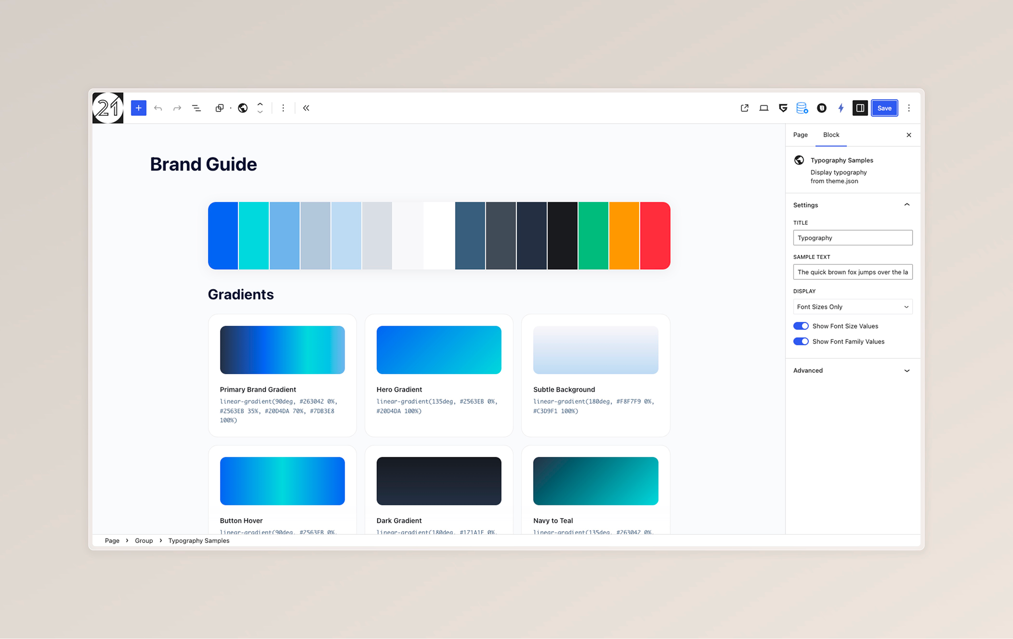
Gradient Showcase Block
Card layout with gradient names and CSS code.
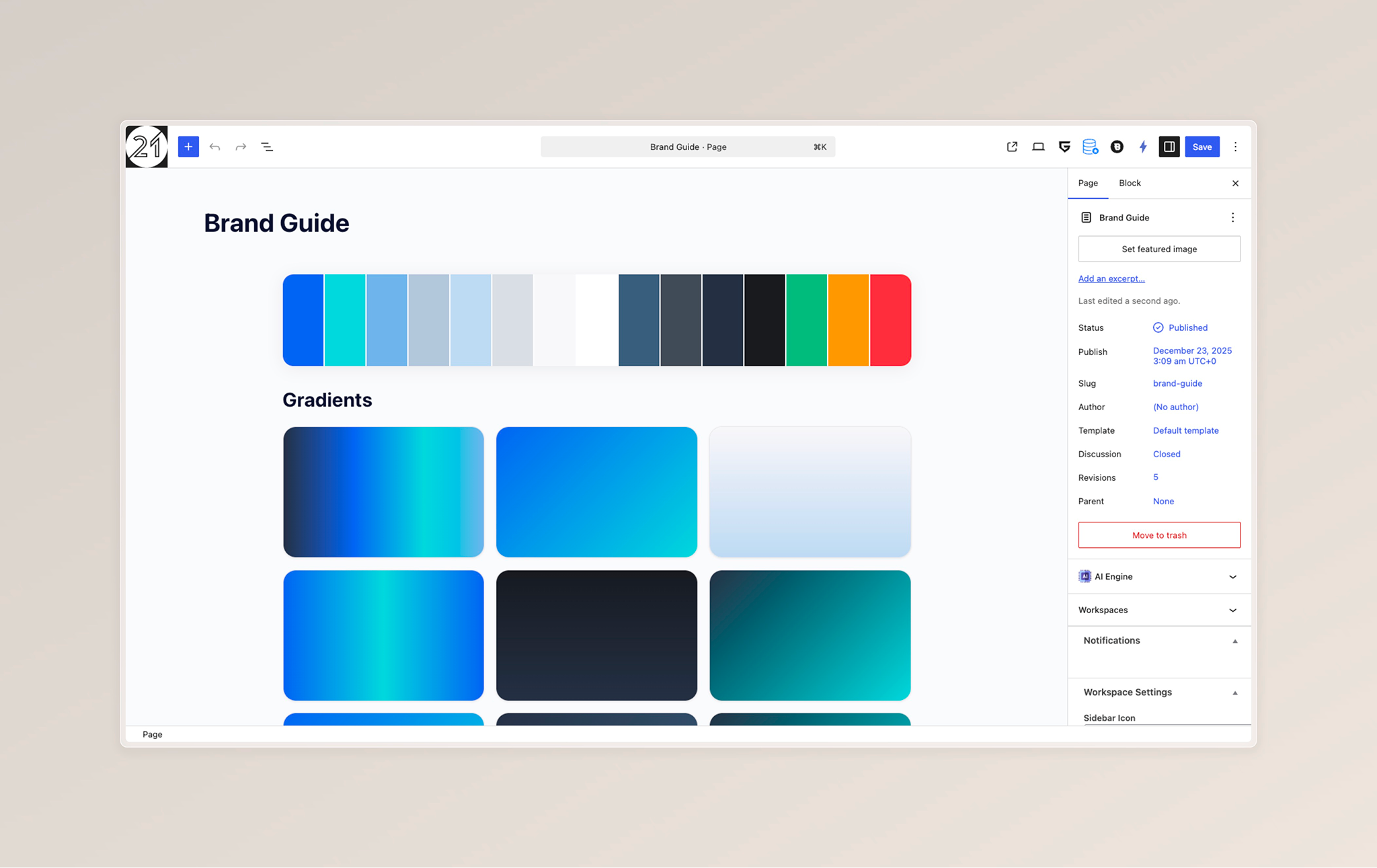
Gradient Grid Layout
Clean grid display of all gradients.
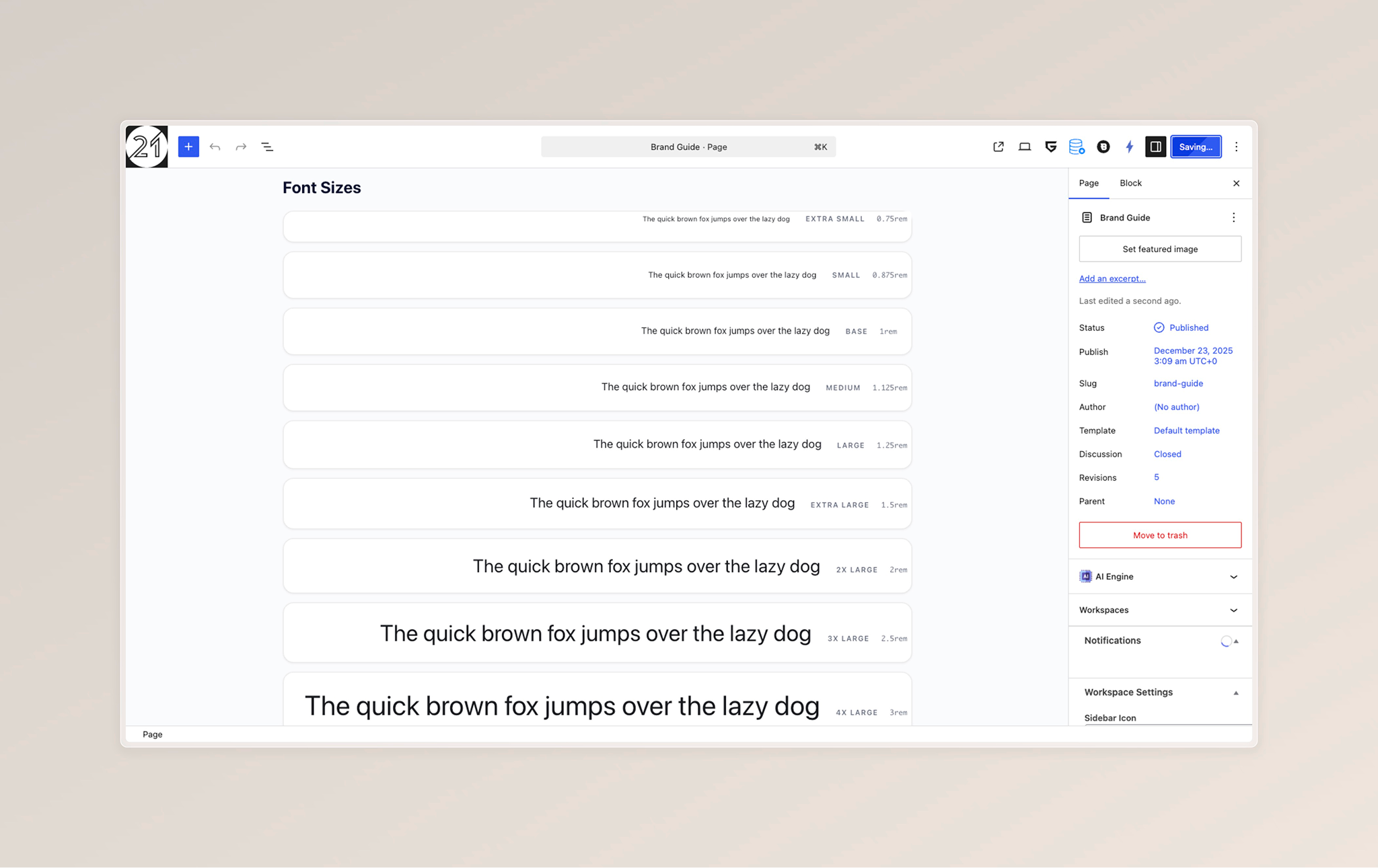
Typography Block
Display font sizes with sample text and values.
Installation
- Download the plugin
- Upload to
/wp-content/plugins/branding-block-kit/ - Activate through the WordPress plugins screen
- Add blocks from the "Brand Style Guide" category in the editor
Usage
Quick Start
Add the Full Style Guide block to instantly display all your theme's design tokens:
<!-- wp:bbk/style-guide {"title":"Brand Style Guide"} /-->Color Palette Examples
Horizontal Expandable Chips (hover to expand):
<!-- wp:bbk/color-palette {"layout":"row","swatchStyle":"chip"} /-->Grid of Cards:
<!-- wp:bbk/color-palette {"layout":"grid","swatchStyle":"card","columns":4} /-->Minimal Color Bars:
<!-- wp:bbk/color-palette {"layout":"grid","swatchStyle":"minimal","columns":6} /-->Filter Specific Colors
Show only specific colors by slug:
<!-- wp:bbk/color-palette {"filterSlugs":"primary,secondary,accent"} /-->Block Options
Color Palette
| Option | Values | Description |
|---|---|---|
| Layout | grid, row, list, inline |
How swatches are arranged |
| Swatch Style | chip, card, circle, pill, stripe, minimal, large-card |
Visual style |
| Swatch Size | small, medium, large |
Size variant |
| Columns | 2-8 | Grid columns (for grid layout) |
| Show Hex | true/false | Display hex values |
| Show Name | true/false | Display color names |
| Show Slug | true/false | Display CSS variable name |
| Filter Slugs | comma-separated | Only show specific colors |
Typography Samples
| Option | Values | Description |
|---|---|---|
| Display | all, sizes, families |
What to show |
| Sample Text | string | Preview text |
| Show Font Size | true/false | Show size values |
| Show Font Family | true/false | Show family values |
Spacing Scale
| Option | Values | Description |
|---|---|---|
| Direction | horizontal, vertical |
Bar orientation |
| Show Value | true/false | Display size values |
| Show Name | true/false | Display token names |
Requirements
- WordPress 6.0+
- PHP 8.0+
- A theme with
theme.jsonconfiguration
Customization
CSS Variables
The plugin uses CSS custom properties that you can override:
.bbk-brand-block {
    --bbk-bg-card: #ffffff;
    --bbk-border-color: rgba(0, 0, 0, 0.1);
    --bbk-text-primary: #171A1F;
    --bbk-text-secondary: #374151;
    --bbk-text-tertiary: #6B7280;
    --bbk-accent: #2563EB;
    --bbk-radius-lg: 16px;
    --bbk-shadow-sm: 0 1px 3px rgba(0, 0, 0, 0.08);
    --bbk-shadow-md: 0 4px 12px rgba(0, 0, 0, 0.1);
}
Dark Mode
Dark mode is applied when:
[data-theme="dark"]is on a parent element.is-dark-themeclass is present
Changelog
1.0.0
- Initial release
- 8 block types for displaying design tokens
- Multiple layout and swatch style options
- Dark/light mode support
- Print styles for PDF generation
License
GPL v2 or later
Credits
Created by Derin Tolu