WP Table Block Extended
Extends the WordPress core table block with custom styling options including header colors, sticky columns, cell widths, and CTA buttons.
by Firas Codes · github.com/firasdeveloper/wp-table-block-extended · website
Install
No release zip yet. The repository archive installs, but the folder name will carry the branch suffix and updates will not flow:
wp plugin install https://github.com/firasdeveloper/wp-table-block-extended/archive/refs/heads/main.zipExtending the WordPress Core Table Block: A Complete Guide
Learn how to extend the WordPress Gutenberg table block with custom styling options, sticky columns, and CTA buttons without creating a new block from scratch.
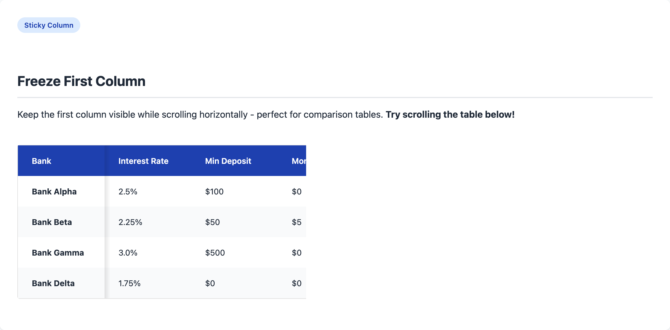
Table of Contents
- Introduction
- Why Extend Instead of Create?
- Architecture Overview
- Implementation Deep Dive
- Live Demo
- Installation
- Usage Guide
- Integration with Headless WordPress
Introduction
WordPress's Gutenberg editor comes with a solid table block, but it often lacks the customization options needed for real-world projects. Instead of building a custom table block from scratch, we can extend the core block using WordPress's powerful filter system.
This approach gives us:
- Header color themes (Primary, Dark, Light, Success, Warning)
- Sticky first column for horizontal scrolling
- Minimum cell width control
- Borderless option for cleaner designs
- CTA buttons inside table cells
- Custom cell width control via shortcodes
Why Extend Instead of Create?
Building a custom block from scratch means:
- Recreating all the table editing logic
- Maintaining compatibility with WordPress updates
- Duplicating accessibility features
- More code to maintain
By extending the core block, we:
- Leverage WordPress's battle-tested table editor
- Get automatic updates and improvements
- Maintain full compatibility with themes
- Write minimal code focused on our customizations
Architecture Overview
The plugin follows modern PHP 8.1+ OOP standards with PSR-4 autoloading:
wp-table-block-extended/
├── wp-table-block-extended.php     # Bootstrap & autoloader
├── src/
│   ├── Plugin.php                  # Main plugin class (Singleton)
│   ├── Assets.php                  # Script/style enqueueing
│   └── Shortcodes/
│       ├── AbstractShortcode.php   # Base shortcode class
│       ├── CTA.php                 # CTA button shortcode
│       └── Placeholder.php         # Cell width shortcode
├── src/                            # JavaScript source
│   ├── index.js                    # Editor customizations
│   ├── editor.scss                 # Editor styles
│   └── style.scss                  # Frontend styles
├── build/                          # Compiled assets
├── docs/                           # GitHub Pages demo
├── composer.json                   # PHP dev tools (optional)
└── package.json                    # JS build tools
Key Design Patterns
| Pattern | Implementation | Purpose |
|---|---|---|
| Singleton | Plugin::instance() |
Single plugin instance |
| PSR-4 Autoloading | Namespaced classes | Auto-load classes on demand |
| Separation of Concerns | Assets, Shortcodes classes | Each class has one responsibility |
| Abstract Base Class | AbstractShortcode |
Shared shortcode functionality |
How It Works
- Filter Hooks: We use
blocks.registerBlockTypeto add custom attributes andeditor.BlockEditto inject our controls - Class-Based Styling: Toggle controls add/remove CSS classes to the block
- PHP Shortcodes: OOP shortcode classes handle CTA buttons and cell width placeholders
- CSS Custom Properties: Make the styles easily customizable
Implementation Deep Dive
Part 1: Adding Custom Attributes
First, we hook into block registration to add our custom attributes:
import { addFilter } from '@wordpress/hooks';

function addTableBlockAttributes(settings) {
    // Only modify the core/table block
    if (settings.name !== 'core/table') {
        return settings;
    }

    // Add custom attribute for header color
    settings.attributes = {
        ...settings.attributes,
        headerBackgroundColor: {
            type: 'string',
            default: 'primary',
        },
    };

    // Remove default stripes style (we apply it automatically)
    if (settings.styles) {
        settings.styles = settings.styles.filter(
            (style) => style.name !== 'stripes'
        );
    }

    return settings;
}

addFilter(
    'blocks.registerBlockType',
    'wtbe/add-table-attributes',
    addTableBlockAttributes
);
Key Points:
- The
blocks.registerBlockTypefilter runs when any block is registered - We check for
core/tableto only modify the table block - New attributes extend the existing ones without overwriting
- We can also modify the available block styles
Part 2: Creating Inspector Controls
Next, we wrap the block's edit component to add our custom controls:
import { InspectorControls } from '@wordpress/block-editor';
import { PanelBody, SelectControl, ToggleControl } from '@wordpress/components';
import { addFilter } from '@wordpress/hooks';

function TableBlockEdit({ BlockEdit, ...props }) {
    // Skip non-table blocks
    if (props.name !== 'core/table') {
        return <BlockEdit {...props} />;
    }

    const { attributes, setAttributes } = props;

    // Helper to toggle CSS classes
    function handleClassToggle(checked, classToToggle) {
        let newClassName = attributes?.className?.trim() || '';
        // Remove the class if it exists
        newClassName = newClassName.replace(
            new RegExp(`\\s?${classToToggle}`),
            ''
        );
        // Add it back if checked
        if (checked) {
            newClassName = `${newClassName} ${classToToggle}`.trim();
        }
        setAttributes({ className: newClassName });
    }

    // Parse current state from className
    const className = attributes?.className || '';
    const freezeFirstColumn = className.includes('wtbe-freeze-first-col');
    const noBorders = className.includes('wtbe-no-borders');

    return (
        <>
            <BlockEdit {...props} />
            <InspectorControls>
                <PanelBody title="Table Style Options" initialOpen={true}>
                    <ToggleControl
                        label="Freeze First Column"
                        checked={freezeFirstColumn}
                        onChange={(checked) =>
                            handleClassToggle(checked, 'wtbe-freeze-first-col')
                        }
                        help="Keep the first column visible when scrolling"
                    />
                    <ToggleControl
                        label="Remove Borders"
                        checked={noBorders}
                        onChange={(checked) =>
                            handleClassToggle(checked, 'wtbe-no-borders')
                        }
                    />
                </PanelBody>
            </InspectorControls>
        </>
    );
}

// Higher-order component wrapper
function addCustomControlsToTableBlock(BlockEdit) {
    return (props) => <TableBlockEdit BlockEdit={BlockEdit} {...props} />;
}

addFilter(
    'editor.BlockEdit',
    'wtbe/table-inspector-controls',
    addCustomControlsToTableBlock
);
Key Points:
editor.BlockEditfilter wraps the edit component- We render the original
<BlockEdit>plus our controls - State is stored in
classNameattribute (persisted automatically) - We parse the class string to determine toggle states
Part 3: Frontend Styles
The CSS uses custom properties for easy customization:
:root {
    --wtbe-cell-padding-x: 24px;
    --wtbe-cell-padding-y: 16px;
    --wtbe-header-primary: #1e40af;
    --wtbe-header-dark: #1f2937;
    --wtbe-row-odd: #ffffff;
    --wtbe-row-even: #f9fafb;
}

.wp-block-table {
    font-size: 14px;
    overflow-x: auto;

    table {
        border: 1px solid #e0e0e0;
        border-radius: 4px;
        border-collapse: separate;
    }

    th {
        background: var(--wtbe-header-primary);
        color: white;
        padding: var(--wtbe-cell-padding-y) var(--wtbe-cell-padding-x);
    }

    // Zebra stripes
    tbody tr:nth-of-type(odd) td {
        background-color: var(--wtbe-row-odd);
    }
    tbody tr:nth-of-type(even) td {
        background-color: var(--wtbe-row-even);
    }

    // Header color variants
    &.wtbe-header-bg-dark th {
        background-color: var(--wtbe-header-dark);
    }

    // Sticky first column
    &.wtbe-freeze-first-col {
        th:first-child,
        td:first-child {
            position: sticky;
            left: 0;
            z-index: 2;

            &::after {
                content: '';
                position: absolute;
                top: 0;
                bottom: 0;
                left: 100%;
                width: 10px;
                background: linear-gradient(
                    to right,
                    rgba(0,0,0,0.1),
                    transparent
                );
            }
        }
    }
}
Key Points:
- CSS custom properties allow theme customization
- Class-based modifiers match the toggle controls
- Sticky positioning with shadow creates the "freeze" effect
border-collapse: separateenables border-radius
Part 4: Shortcodes for Advanced Features
For features that need dynamic HTML, we use PHP shortcodes:
/**
 * CTA button shortcode for table cells
 * Usage: [wtbe_cta url="https://example.com" label="Learn More"]
 */
function wtbe_cta_shortcode($atts) {
    $atts = shortcode_atts(
        array(
            'url'       => '#',
            'label'     => 'Click Here',
            'newtab'    => 'true',
            'nofollow'  => 'false',
            'sponsored' => 'false',
        ),
        $atts
    );

    $newtab = filter_var($atts['newtab'], FILTER_VALIDATE_BOOLEAN);
    $nofollow = filter_var($atts['nofollow'], FILTER_VALIDATE_BOOLEAN);

    $rel_parts = array();
    if ($nofollow) $rel_parts[] = 'nofollow';
    if ($newtab) {
        $rel_parts[] = 'noopener';
        $rel_parts[] = 'noreferrer';
    }

    return sprintf(
        '<a href="%s"%s class="wtbe-cta"%s>%s</a>',
        esc_url($atts['url']),
        $newtab ? ' target="_blank"' : '',
        !empty($rel_parts) ? ' rel="' . implode(' ', $rel_parts) . '"' : '',
        esc_html($atts['label'])
    );
}
add_shortcode('wtbe_cta', 'wtbe_cta_shortcode');

/**
 * Placeholder shortcode for forcing cell width
 * Usage: [wtbe_placeholder width="300px"]
 */
function wtbe_placeholder_shortcode($atts) {
    $atts = shortcode_atts(array('width' => ''), $atts);

    if (empty($atts['width'])) {
        return '<div style="background:#ffb6b6;padding:4px;">
            Error: width is required
        </div>';
    }

    $width = $atts['width'];
    if (is_numeric($width)) $width .= 'px';

    // Account for cell padding
    $calc_width = 'calc(' . $width . ' - (2 * var(--wtbe-cell-padding-x)))';

    return '<div style="width:' . esc_attr($calc_width) . ';height:0;"></div>';
}
add_shortcode('wtbe_placeholder', 'wtbe_placeholder_shortcode');
Key Points:
- Shortcodes allow complex HTML in table cells
shortcode_attsprovides defaults and sanitization- Boolean attributes need explicit conversion
- The placeholder uses an invisible div to force width
Live Demo
Open demo/demo.html in your browser to see all features in action, including:
- Default table with zebra stripes
- All header color variants
- Sticky first column (horizontal scroll)
- CTA buttons in cells
- Borderless tables
- Centered headers
Installation
For Users (Simple)
- Download or clone the repository
- Run
npm install && npm run buildto compile assets - Upload the plugin folder to
/wp-content/plugins/ - Activate "WP Table Block Extended" in WordPress
Note: Composer is NOT required for users. The plugin works out of the box!
For Developers
# Install JavaScript dependencies (required)
npm install

# Start development mode (watches for changes)
npm run start

# Build for production
npm run build

# Lint JavaScript and CSS
npm run lint
npm run lint:fix
Development Tools (Optional)
Why Composer? (Optional for Developers)
This plugin includes a composer.json for developers who want additional code quality tools. Composer is completely optional - the plugin works perfectly without it.
| Tool | Purpose | Command |
|---|---|---|
| PHPCS | Checks code follows WordPress Coding Standards | composer phpcs |
| PHPStan | Static analysis - finds bugs without running code | composer phpstan |
What is Static Analysis?
Static analysis examines your code without executing it to find potential bugs:
function add(int $a, int $b): int {
    return $a + $b;
}

add("hello", "world"); // PHPStan catches this: "Parameter #1 expects int, string given"
Benefits:
- Catches type errors before runtime
- Finds undefined variables and methods
- Identifies dead/unreachable code
- Detects null pointer issues
Setting Up Dev Tools (Optional)
# Install PHP dev dependencies
composer install

# Run code style check (WordPress Coding Standards)
composer phpcs

# Auto-fix code style issues
composer phpcbf

# Run static analysis (catches bugs without running code)
composer phpstan
Why is Composer Optional?
- WordPress core doesn't use Composer - We follow WP conventions
- No external PHP dependencies - Plugin is self-contained
- Built-in autoloader - PSR-4 autoloading works without Composer
- Dev tools only - Composer is only needed for PHPCS/PHPStan
Usage Guide
In the Block Editor
- Add a Table block to your post
- Open the block settings sidebar
- Find "Table Style Options" panel
- Configure your preferred options:
- Header Background Color: Choose a theme color
- Remove Table Borders: Toggle outer border
- Minimum Cell Width: Ensure cells don't get too narrow
- Freeze First Column: Keep first column visible on scroll
- Center Header Text: Center-align header cells
Using Shortcodes
CTA Button
[wtbe_cta url="https://example.com" label="Sign Up" nofollow="true"]| Attribute | Description | Default |
|---|---|---|
url |
Link destination | # |
label |
Button text | Click Here |
newtab |
Open in new tab | true |
nofollow |
Add nofollow | false |
sponsored |
Add sponsored | false |
Cell Width Placeholder
[wtbe_placeholder width="250px"]Add this shortcode to a cell to force a minimum width.
Integration with Headless WordPress
When using WordPress as a headless CMS with Next.js or similar:
1. Include the Styles
The table styles need to be included in your frontend. You can:
Option A: Copy src/style.scss to your Next.js project and import it:
// app/layout.js or _app.js
import '@/styles/table-block.css';
Option B: Fetch styles from WordPress REST API and inject them:
// In your page component
<style dangerouslySetInnerHTML={{ __html: tableStyles }} />
2. Process Shortcodes
The shortcodes are processed server-side by WordPress. When fetching content via REST API or GraphQL, the shortcodes will already be converted to HTML.
If you're using raw block content, you'll need to handle shortcode conversion in your frontend:
// Simple shortcode parser for [wtbe_cta]
function parseTableCta(content) {
    return content.replace(
        /\[wtbe_cta([^\]]*)\]/g,
        (match, attrs) => {
            const url = attrs.match(/url="([^"]+)"/)?.[1] || '#';
            const label = attrs.match(/label="([^"]+)"/)?.[1] || 'Click Here';
            return `<a href="${url}" class="wtbe-cta" target="_blank" rel="noopener">${label}</a>`;
        }
    );
}
3. Handle Sticky Columns
The sticky column feature uses CSS position: sticky. Ensure your container doesn't have overflow: hidden which would break the sticky behavior:
.article-content {
    /* Don't use overflow: hidden on the table container */
    overflow-x: auto; /* Allow horizontal scroll */
}
Customization
Override CSS custom properties in your theme:
:root {
    --wtbe-header-primary: #your-brand-color;
    --wtbe-cta-bg: #your-button-color;
    --wtbe-cell-padding-x: 16px;
    --wtbe-cell-padding-y: 12px;
}
Browser Support
- Chrome/Edge (latest)
- Firefox (latest)
- Safari (latest)
- Mobile browsers
The sticky column feature requires CSS position: sticky support (all modern browsers).
License
GPL-2.0-or-later
Author
Firas Codes firascodes.ca | GitHub